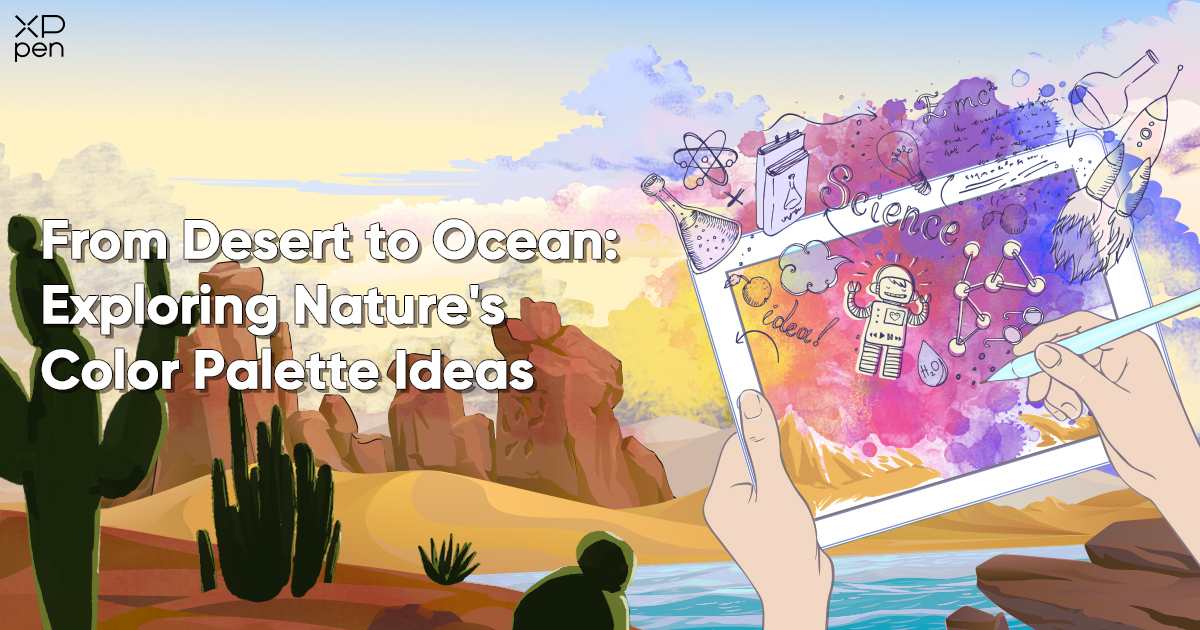
From Desert to Ocean: Exploring Nature's Color Palette Ideas
TIPSNature has been a constant muse for artists, designers, and anyone who loves beauty. It offers a vast range of colors, textures, and patterns that inspire stunning nature color palettes.
We'll explore the beautiful landscapes on Earth, from deserts to forests and oceans, discovering their rich and diverse nature color palettes. Let's start with the captivating hues of the desert first!
Desert Color Palette
The Desert's Hidden Treasures
The desert may seem barren at first, but it reveals a rich desert color palette. Beyond the initial sandy view, you'll find a vibrant range of hues showcasing nature's beauty in harsh conditions.
1. Earthy Tones: The Foundation of the Desert

The foundation of the desert color palette is formed by earthy tones such as sandy beige, warm terracotta, and dusty brown. These colors are the backdrop for the desert's stark beauty.
The science behind these colors lies in the minerals and sediments found in desert soils. For instance, the reddish terracotta hues often come from iron oxide in the sand. These earthy tones, rooted in geology, create a grounded and natural feeling.
2. Sunlit Gold: The Magic of Desert Sunsets

When the sun sets in the desert, it paints the landscape in warm golden hues, that elicits an inviting atmosphere. These golden shades, from soft yellows to deep oranges, are key to the desert's color palette. The golden tones are a result of the angle at which sunlight penetrates the Earth's atmosphere, scattering shorter wavelengths and allowing the warm colors to dominate.
The Wavelength, Frequency and Photon energy of visible lights:
| Color | Wavelength (nm) | Frequency (THz) | Photon energy (eV) |
|---|---|---|---|
| violet | 380–450 | 670–790 | 2.75–3.26 |
| blue | 450–485 | 620–670 | 2.56–2.75 |
| cyan | 485–500 | 600–620 | 2.48–2.56 |
| green | 500–565 | 530–600 | 2.19–2.48 |
| yellow | 565–590 | 510–530 | 2.10–2.19 |
| orange | 590–625 | 480–510 | 1.98–2.10 |
| red | 625–750 | 400–480 | 1.65–1.98 |
Source: Wikipedia
3. Desert Rose: A Touch of Femininity

Amidst the arid sands, you may come across delicate desert flowers with petals in shades of pink and mauve. These subtle but enchanting colors add a touch of femininity to the desert's color palette.
These colors are often the result of specific desert plant adaptations and the unique pigments they've developed to thrive in this harsh environment.
4. Sky High: The Desert's Brilliant Blues

During the day and twilight, the desert often boasts clear blue skies that contrast the warm earthy tones below. These brilliant blues are an essential component of the desert palette.
Dive deeper into the beauty and diversity of desert landscapes - National Geographic's Guide to Desert Ecosystems. In fact, dunes are just about 10% of deserts, while the rest are made up of mountains, rocks, sandy plains, and salt flats.
Creating a Desert Color Palette
To create a desert-inspired color palette, you can start with a base of sandy beige or terracotta and add accents of golden yellows and desert rose. By capturing the essence of a desert sunset, you can evoke the feeling of warmth and tranquility in your design.
With the XPPen Artist 12 3rd's pressure sensitivity, seamlessly transitioning between these shades of gold becomes a breeze. This feature not only enhances your creative process but also ensures that you can replicate the radiant desert glow with precision, making your artwork a true reflection of the natural world.
It's important to note that the desert color palette can vary depending on the season. During spring, after rainfall, you may witness a burst of vibrant greens as dormant plants come to life. In contrast, the summer heat can intensify the warm earthy tones.
Sunrise Color Palette
A New Day's Promise
The colors of a sunrise are a symbol of hope and new beginnings. As the sun rises above the horizon, it paints the sky with a breathtaking array of sunrise color palette colors that can inspire a unique color palette.
1. Gentle Pinks and Lavenders: The Early Serenity

The early moments of a sunrise often feature soft pastel pinks and lavenders. These delicate hues create a sense of serenity and optimism. These colors are created by the scattering of shorter wavelengths of light during sunrise.
2. Warm Corals and Oranges: The Rising Energy

As the sun climbs higher, it bathes the sky in warm corals and oranges. These colors radiate energy and enthusiasm. The warm tones are a result of the sun's angle, which allows longer wavelengths to predominate during this time.
3. Golden Yellows: The Joyful Finale

The final stage of sunrise is marked by brilliant golden yellows that evoke feelings of warmth and happiness. These hues are perfect for infusing a sense of joy into any palette.
4. Awakening Blues: The Dawn of Azure Tranquility

The transition between night and day often includes shades of calming azure blue, symbolizing the awakening of a new day.
Creating a Sunrise Color Palette
To create a sunrise-inspired color palette, begin with gentle pinks and lavenders, transition to warm corals and oranges, and finish with golden yellows. This progression can capture the emotional journey of a sunrise in your design.
The colors of a sunrise can also be influenced by the weather and geographical location. In some regions, sunrise colors may be more intense during specific seasons, while cloud cover can affect the hues.
Sunset Color Palette
The Artistry of a Sunset
As day turns into night, we're treated to a mesmerizing display of colors in the sunset color palette. Whether it's over the ocean, in a forest, or across a desert horizon, sunsets are always captivating with their vivid and shifting hues.
1. Fiery Reds and Oranges: The Early Splendor

During the beginning of a sunset, you'll typically see vibrant reds and oranges. As the sun lowers in the sky, its light passes through more layers of the atmosphere, scattering blue light and allowing red and yellow light to reach your eyes directly.
Sometimes, the entire western sky seems to be glowing. This is because small particles of dust, pollution, or other aerosols also scatter blue light, leaving more pure red and yellow light to pass through the atmosphere.
These colors evoke feelings of warmth and passion, making them perfect for creating an energetic and vibrant sunset color palette.
2. Mellow Purples and Pinks: A Soothing Transition

As the sun continues to descend, the sky often takes on shades of soft purples and pinks. These cooler, pastel tones bring a sense of calm and tranquility to any color scheme, making them ideal for creating a soothing atmosphere. The interplay of light and atmosphere creates these soft, romantic shades.
3. Twilight Blues: The Mystical Nightfall

Just after the sun has set, the sky transforms into shades of deep blue and indigo. These colors capture the mystery and depth of the night, making them a beautiful contrasting color to any sunset-inspired palette.
Creating a Sunset Color Palette
To create a sunset-inspired color palette, begin with the fiery reds and oranges, transition to mellow purples and pinks, and finish with deep twilight blues. This progression can be used to evoke the emotional journey of a sunset in your design.
The colors of a sunset can also vary with the seasons. In some regions, sunsets during winter may feature cooler, bluer tones, while summer sunsets can be more fiery and intense.
Forest Color Palette
A Symphony of Greenery
Stepping into a forest is like entering a world of endless greenery and natural wonders. The forest offers a captivating color palette inspired by nature, a harmonious blend of earthy greens, rich browns, and vibrant pops of color from various plant species.
1. Lush Green Canopy: The Heart of the Woods

The primary feature of a forest's color palette is its lush green canopy. This forest green, vibrant, symbolizes growth, vitality, and renewal. It serves as the cornerstone of the forest's color spectrum.
The science behind the green color of leaves is chlorophyll, the pigment responsible for photosynthesis in plants.
2. Earthy Browns: The Trunks and Leaves

As you wander through the forest, the ground beneath your feet unfolds like a rich tapestry, adorned with an array of earthy brown tones. From the majestic tree trunks that stretch skyward to the leaves that have carpeted the forest floor, these hues infuse a sense of warmth and depth into the overall palette, anchoring the lush greens that thrive overhead.
3. Floral Accents: Nature's Pops of Color

The forest isn't just about greenery; it's also home to many wildflowers. The blossoms contribute splashes of color, ranging from delicate blues and purples to bright yellows and reds, punctuating the forest landscape with their beauty.
Forest Green Color Palette
The Depths of Lush Woodlands
Now, let's delve deeper into the forest green color palette, drawing inspiration from the heart of lush woodlands. This unique palette is a celebration of nature's greenest offerings.
1. Mossy Greens: Serenity and Timelessness

When you look closer, you'll encounter the enchanting world of moss-covered rocks and tree trunks. These shades of mossy green add a sense of tranquility and timelessness to any design, creating a connection with the forest's ancient beauty.
Moss is a unique plant species that thrives in moist and shaded areas, contributing to these soothing green hues.
2. Vibrant Fern Fronds: Freshness and Growth

Underneath the shades of towering trees are the vibrant fronds of ferns that bring a brighter, more lively green to the palette. This hue embodies the freshness and continuous growth that characterizes the forest.
Ferns have adapted to grow in the understory of forests, contributing to this specific shade of green.
3. Balanced Olive Undertones: Earthy Depth

To provide a more muted and earthy touch, consider incorporating olive green. These subtle undertones offer depth and complexity, pairing seamlessly with the brighter greens to create a balanced forest green color palette.
Olive tones are often associated with the presence of chlorophyll in the leaves of certain tree species.
Creating a Forest Color Palette
To create a forest-inspired color palette, start with a base of deep forest green, add earthy browns, and punctuate with pops of wildflower-inspired colors. This combination captures the essence of the forest's beauty and diversity.
Embrace the artistry of nature with the XPPen Artist 12 3rd's responsive stylus. It allows you to add intricate details to the rugged bark of trees and capture the subtle transitions of color in the fallen leaves with ease, seamlessly integrating your creative vision into the heart of the forest.
Forests undergo significant seasonal changes, with spring bringing vibrant greens and colorful blooms, while autumn sees a transformation into rich, earthy tones of red, orange, and yellow.
Ocean Color Palette
The Serenity of the Sea
The ocean, with its vast expanse of water, is a study in shades of blue and green. The colors of the ocean can vary greatly depending on factors like depth, weather, time of day, coral formation, and even the presence of algae in the surface.
1. Azure Blue: Crystal-Clear Waters

The crystal-clear waters of a tropical paradise often appear in varying shades of azure blue. This serene color is popular for creating calming and inviting environments. The blue color of the ocean is primarily due to the selective absorption and scattering of sunlight by water molecules.
2. Deep Navy: The Ocean's Mystique

As you move further from the shore, the ocean's color deepens into a rich navy blue. This dark and mysterious hue is perfect for adding drama and sophistication to a color palette. The deep blue of the ocean reflects the absence of direct sunlight, which allows the water to appear darker.
3. Emerald Green: Shallow Waters' Vibrancy

In areas where the water is shallow (like beaches and sandbars) and sunlight can penetrate, you'll find the vibrant greens of coral reefs and aquatic plants. These colors infuse energy and vibrancy into the ocean-inspired palette.
The green hues in shallow waters are often associated with the presence of microscopic marine life and chlorophyll-containing organisms.
Creating an Ocean Color Palette
To create an ocean-inspired color palette, use shades of azure blue, deep navy, and vibrant emerald green. This combination can transport the essence of the ocean's beauty and diversity into your design.
The colors of the ocean can vary with the seasons and geographical locations. For instance, colder waters may have cooler, bluer tones, while tropical seas often feature a more extensive range of blue and green shades.
Creating Nature-Inspired Color Palettes
Understanding the science and principles behind each of these nature-inspired color palettes can be a valuable tool for artists and designers looking to harness the beauty of the natural world. When creating your own nature-inspired color palettes, consider the following steps:
-
Research: Dive into the specific environment or landscape you want to draw inspiration from. Learn about the geology, botany, and climatic factors that influence the colors found in that environment.
-
Color Theory: Familiarize yourself with color theory, including concepts like complementary colors, analogous colors, and color harmonies. This knowledge will help you create balanced and visually appealing palettes.
-
Observation: Spend time in the natural environment you're drawing inspiration from. Observe the colors in different lighting conditions and seasons. Take photographs and make color swatches.
-
Digital Tools: Use digital design tools and software, such as Adobe Creative Suite or XPPen's graphic tablets, to create and experiment with your color palettes. These tools provide the flexibility to fine-tune and adjust colors to your liking.
-
Feedback: Don't hesitate to seek feedback from peers or mentors in the creative industry. They can offer valuable insights and suggestions to refine your palette.
Do you know that for different output mediums, the idea color space differs? Check out on the difference between sRGB and Adobe RGB to display your artwork in the best true colors!
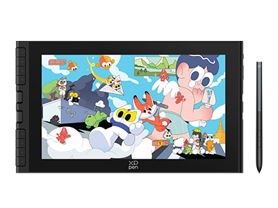
Drawing Nature with XPPen Artist 12 3rd
Turn the beautiful scenery and colors of nature into a work of art! Take that inspiration into digital art with the perfect partner, XPPen drawing tablet. The Artist 12 3rd is the perfect companion for artists on the go.

The Artist 12 3rd introduces a new scroll wheel design alongside eight shortcut keys, allowing you to zoom, pan, and adjust brushes effortlessly—no need for a separate keyboard. Despite its budget-friendly price, it comes equipped with XP-Pen’s latest X4 smart chip stylus, delivering noticeably faster, smoother, and more precise performance.
The stylus magnetically attaches to the top of the screen, keeping it secure and reducing the chance of misplacing it. Overall, it’s a reliable and cost-effective entry-level pen display built to last.
Here are some key features of the XPPen Artist 12 3rd:
-
X4 Smart Chip Stylus with 16K Pressure Levels
-
2g Initial Activation Force
-
11.9-inch FHD Display with 99% sRGB Color Gamut Coverage
-
Dual X-Dial and Eight Shortcut Keys
-
One Cable Connection
Final Words
Nature's color palettes inspire artists, designers, and creators to capture the beauty of the natural world in their work.
Nature provides a wide range of colors, from deserts to forests and sunsets to sunrises. You can use these diverse colors in your creative projects. Whether you prefer ocean blues, forest greens, or desert reds, you have plenty of options to choose from.
So, the next time you need color inspiration, look no further than the great outdoors, where nature's endless color palette ideas await your discovery!
Find more drawing references from nature here: 5 Surprising Places to Find Free Drawing Reference
About Us
Founded in 2005, XPPen is a leading global brand in digital art innovation under Hanvon UGEE. XPPen focuses on the needs of consumers by integrating digital art products, content, and services, specifically targeting Gen-Z digital artists. XPPen currently operates in 163 countries and regions worldwide, boasting a fan base of over 1.5 million and serving more than ten million digital art creators.
Learn moreRecommended Articles
TIPS 5 Surprising Places to Find Free Drawing Reference KNOWLEDGE Positive and Negative Space in Digital Art: What Every Artist Needs to Know


Looking for the Best Drawing & Design Apps?
Discover essential drawing techniques, expert tips, and the best app recommendations to boost your creativity and master digital art.
