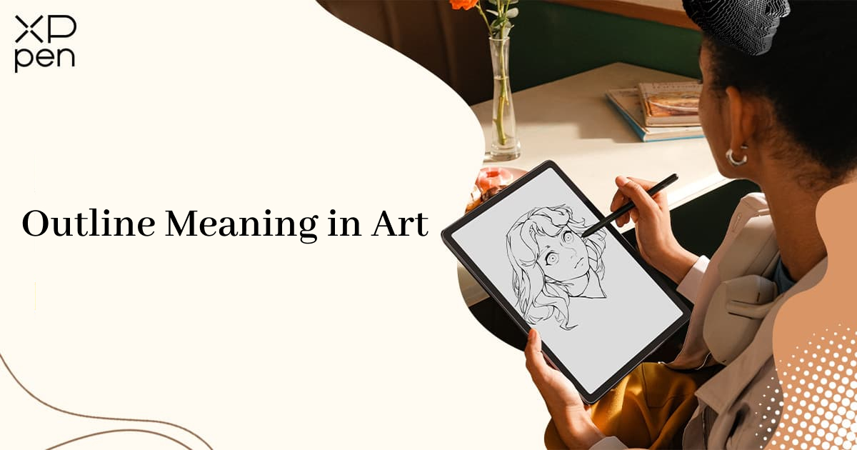
Outline Meaning in Art: Definition, Types & Drawing Tips
KNOWLEDGEIf you've ever picked up a pencil and drawn a line around the edge of a shape, you've already used an outline. But what exactly is this thing we call an "outline"? In art, the outline is one of the most fundamental functions of line, which is one of the seven basic elements of visual art.
This guide breaks down the outline meaning in art, why it matters, the main types you should know, how famous artists use outlines, and how to apply them effectively in your own work.
What Is an Outline in Art?
An outline is a line that marks the outer edge of a shape or object, separating it from the background or from other shapes around it. Think of a coloring book page: the black lines that form the shape of a flower, an animal, or a person are outlines. Everything inside those lines is meant to be filled in with color or shading.
In simple terms, an outline answers one question: where does this object end and everything else begin?
Outlines can be:
- Even in thickness — like a coloring book line
- Variable in weight — thicker in shadow, thinner in light
- Broken or sketchy — with intentional gaps
- Implied — suggested through color or value shifts rather than a visible line
This flexibility makes outlines useful for beginners and professionals alike, across everything from quick sketches to polished illustrations.
Outline vs. Contour Line: What's the Difference?
Outline and contour line are closely related, and the terms are sometimes used interchangeably. The word contour actually comes from French and means “outline.” But in art education, an outline usually means the outside edge of a shape, while a contour line helps show the form of the object, including how its surface curves and turns.
Here's a simple comparison:
| Feature | Outline | Contour Line |
|---|---|---|
| What it defines | Outer boundary of a shape | Surface form and structure (inner + outer) |
| Focus | External border only | External + internal details |
| Visibility | Usually a visible line | Usually a visible line |
| Dimension | 2D (flat) | Suggests 3D |
Why Outlines Matter in Art
Outlines might look simple, but they do a lot of work in a piece of art. Here's why artists rely on them.
1. They Create Clarity
Outlines make it instantly clear what an object is and where it stops. This is especially important in comics and cartoons, where readers need to understand the image at a glance. Without clear outlines, panels can become confusing — especially when multiple characters or objects overlap.
2. They Guide the Eye
A strong outline leads the viewer's eye around the composition. Thicker lines draw attention to the main subject. Thinner lines push secondary elements into the background. This principle — called visual hierarchy — is how artists tell viewers what to look at first, second, and third.
3. They Separate Foreground from Background
Without an outline, some shapes blend into the background, especially when colors are close in value. A clean outline keeps every object visually distinct, which is why coloring books, logos, and educational illustrations all depend on them.
4. They Set the Style
Outlines aren't just functional — they're a stylistic choice. Thick, bold outlines give art a graphic, comic-book feel. Thin, delicate outlines feel more refined and realistic. No outline at all creates a softer, painterly look. The choice of outline style is one of the first decisions that defines the visual identity of your work.
5. They Build Structure
Professional artists rarely start with details. They build: gesture → outline → structure → values → finish. The outline stage acts as scaffolding — it establishes proportions, spatial relationships, and composition before you commit to shading or color. Getting the outline right early prevents costly corrections later.
7 Types of Outlines Used in Art
Not all outlines look the same. Understanding the main types helps you choose the right approach for your subject, style, and medium. Here are the seven most common types:
1. Outer Outline
The most basic form. A single continuous line drawn around the outside of a subject, like tracing a silhouette. Think of a road sign or a logo.
Best for: Logos, character design, educational illustration
Strength: Immediate clarity — viewers recognize the subject instantly
Watch out for: Can flatten depth if used alone without shading or contour
2. Contour-Based Outline
A contour-based outline goes beyond the outer edge. It follows the actual surface of the object — its curves, folds, and plane changes — to suggest three-dimensional form. If you draw the wrinkles in a shirt or the curve of a cheekbone, you're drawing contour, not just outline.
Best for: Figure drawing, portrait studies, observational practice
Key difference: Outline shows the shape; contour shows the form
3. Continuous Outline
The pen never leaves the paper. You draw the entire subject in one unbroken line, which builds confidence, rhythm, and hand-eye coordination.
Best for: Warm-up exercises, expressive sketches
Pro tip: Don't worry about accuracy — let the line flow naturally
4. Broken Outline
Broken outlines intentionally leave gaps where light hits a form. Your brain fills in the missing information, which creates a softer, more natural look than a solid line all the way around.
Best for: Realistic illustration, painterly styles, atmospheric work
Why it works: It mimics how we actually see — edges aren't equally sharp everywhere
5. Gestural Outline
Gestural outlines prioritize movement and energy over precision. The lines are loose, fast, and expressive. Think of a 30-second figure sketch where you're capturing the "feel" of a pose, not its exact proportions.
Best for: Figure drawing, animation, sports illustration
Mindset: Speed over accuracy — capture the action, not the details
6. Implied Outline
One of the most sophisticated techniques. There's no actual drawn line. Instead, the edge is suggested through shifts in color, value, or texture. Two shapes with different tones placed side by side create a visual boundary without any ink.
Best for: Realistic painting, professional illustration
Example: In a landscape painting, the edge of a mountain against a bright sky creates an implied outline — no line needed
7. Silhouette Outline
A silhouette reduces a subject to a single filled shape — usually solid black — with no interior detail at all. It's the ultimate test of whether your design is readable. If a character or object isn't recognizable as a pure silhouette, the underlying design needs work.
Best for: Character design, branding, icon design
Rule of thumb: If it works as a silhouette, it works as a design
How Different Art Styles Use Outlines
The role of an outline changes depending on the art style:
· Cartoons and comics rely on bold, uniform outlines for instant clarity and stylistic punch. The outline isn't just a tool — it's part of the visual language.
· Anime and manga use variable-width outlines to add energy and expression. A common technique is thicker outer contours with thinner internal details, which improves readability without cluttering the image.
· Realistic painting typically avoids visible outlines altogether. Instead, artists rely on edge control — soft transitions, value contrast, and color relationships — to define forms.
· Flat, minimalist illustration uses clean, uniform outlines to create a simple, modern look. Think of app icons, brand logos, and editorial illustrations.
· Traditional Chinese painting uses baimiao — pure ink outlines without color or shading. This centuries-old tradition treats the line itself as the primary expressive medium, much like the line drawings of Western modernists.
How Digital Artists Use Outlines
Digital tools have expanded what's possible with outlines. Software like Procreate, Clip Studio Paint, and Adobe Illustrator offers capabilities that traditional media can't match.
· Vector outlines: In programs like Adobe Illustrator, outlines are defined mathematically rather than as pixels. This means you can scale a logo or illustration from a favicon to a billboard without losing any line quality. Vector outlines are the backbone of branding, icon design, and interface illustration.
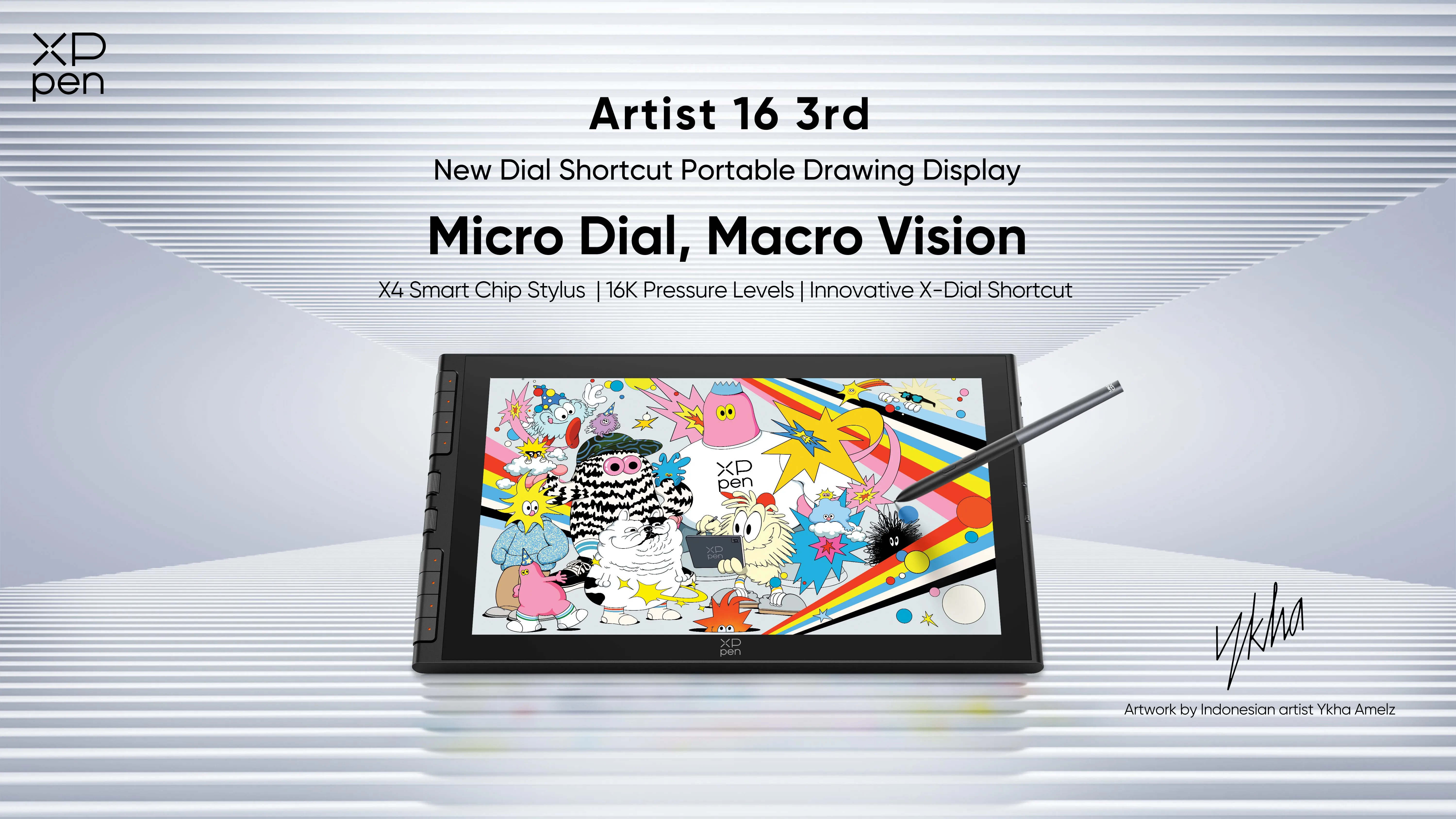
· Pressure-sensitive line weight: Digital pen displays detect how hard you press, letting you vary line thickness in real time, just like a traditional brush or ink pen. Thicker strokes in shadow areas, thinner strokes in light — this single technique adds depth that flat outlines can't achieve. Tablets like the XPPen Artist 16 3rd are designed for exactly this workflow, with pressure sensitivity that translates hand pressure into natural line variation.
· Line stabilization: Digital tools can smooth out shaky strokes, which is especially helpful for artists working on small screens or with unsteady hands. This doesn't replace practice, but it removes a technical barrier that frustrates many beginners.
· Separate line layers: Digital artists keep outlines on their own layer, separate from color and shading. This makes it easy to adjust, clean up, or even remove outlines entirely after the rest of the piece is finished — something that's impossible with traditional ink.
Common Mistakes Artists Make with Outlines
Even experienced artists run into these outlining pitfalls. Here's what to watch for — and how to fix it.
· Using uniform line weight throughout. When every line is the same thickness, the image looks flat. Fix: vary your line weight — thicker for the main subject and shadowed edges, thinner for details and highlights.
· Outlining every detail. Adding outlines to every small feature — every strand of hair, every fold — makes a piece look cluttered instead of clean. Fix: Be selective. Outline only what needs separation. Let some edges blend.
· Tracing instead of constructing. Tracing copies the appearance of an object. Construction builds the form from the inside out. Fix: start with basic shapes (circles, rectangles) and build outward. Understand the structure before you outline it.
· Ignoring negative space. The space around your subject is just as important as the subject itself. Fix: pay attention to the shapes your outline creates in the negative space — they affect the overall composition.
· Skipping outlines without a plan. Drawing without outlines can create a beautiful, painterly look — but only if you use light, shadow, and color deliberately to define edges. Fix: if you choose to omit outlines, make sure value contrast and color relationships are strong enough to carry the forms.
Further reading: Positive and Negative Space in Digital Art: What Every Artist Needs to Know
How to Practice and Improve Your Outlines
Improving your outlining skills comes down to consistent, targeted practice:
- Blind contour drawing: Draw an object without looking at your paper. This trains observation and hand-eye coordination. The result will look messy, but the exercise is invaluable.
- Continuous line drawing: Draw a subject without lifting your pen. Focus on flow and rhythm rather than accuracy.
- Silhouette studies: Reduce subjects to solid black shapes. If you can recognize the subject as a silhouette, your design is working.
- One-minute gesture outlines: Set a timer and sketch quickly. Short time limits force you to simplify and capture only what matters.
- Master studies: Copy drawings by artists like Picasso, Matisse, or Haring. Pay attention to their line choices — where they pressed harder, where they broke the line, what they chose to omit.
FAQs
Q1: What is the meaning of an outline in art?
An outline in art is a line that defines the outer boundary of an object, shape, or form. It shows where the subject ends and the background begins, helping viewers recognize shapes instantly. Outlines are one of the most fundamental tools in drawing and appear in everything from cave paintings to digital illustration.
Q2: What is the difference between an outline and a contour line?
An outline shows only the outer edge of an object, like a flat silhouette. A contour line follows the actual surface of the object — including curves, folds, and interior details — to suggest three-dimensional form. In short, an outline shows the shape, while a contour line shows the form.
Q3: What is the difference between an outline and a silhouette?
An outline is the boundary line itself — the drawn edge around a shape. A silhouette is the filled-in shape created by that boundary, usually rendered as a solid color with no interior detail. Every silhouette depends on an outline, but not every outline creates a silhouette.
Q4: What are the main types of outlines in art?
The main types are outer outline, contour outline, continuous outline, broken outline, gestural outline, implied outline, and silhouette outline. Each type creates a different visual effect and serves a different purpose, from bold graphic clarity to subtle atmospheric transitions.
Q5: How can beginners improve their outlines?
Beginners should practice slow, controlled strokes and experiment with varying line thickness. Start with simple shapes, then try exercises like blind contour drawing and continuous line drawing to build observation and confidence. Using a pressure-sensitive tablet can also help you develop a natural feel for line weight.
Q6: What is line weight in art?
Line weight refers to the thickness of a line. Artists use thicker lines to suggest shadow, closeness, or emphasis, and thinner lines for highlights, distance, or delicate details. Varying line weight is one of the simplest ways to add depth and visual interest to an outlined drawing.
Final Words
An outline is far more than a line drawn around a shape. It's a foundational tool that organizes visual information, separates subjects from their backgrounds, guides the viewer's attention, and sets the stylistic tone of an entire piece. From prehistoric cave walls to modern digital canvases, outlines have remained central to how artists communicate form.
Whether you draw bold comic outlines, delicate contour studies, or paintings with no visible lines at all, understanding how outlines work — and when to use or omit them — will make your art clearer, more intentional, and more expressive. The best way to improve is simple: pick up your pen, start with a line, and see where it takes you.
About Us
Founded in 2005, XPPen is a leading global brand in digital art innovation under Hanvon UGEE. XPPen focuses on the needs of consumers by integrating digital art products, content, and services, specifically targeting Gen-Z digital artists. XPPen currently operates in 163 countries and regions worldwide, boasting a fan base of over 1.5 million and serving more than ten million digital art creators.
Learn moreRecommended Articles
KNOWLEDGE How to Join Art Fight 2026: A Full Beginner's Guide OTHERS Rule of Thirds in Drawing and Art with Examples 2026 TIPS 7 Elements of Design: A Complete Guide to the Basics KNOWLEDGE Positive and Negative Space in Digital Art: What Every Artist Needs to Know


Looking for the Best Drawing & Design Apps?
Discover essential drawing techniques, expert tips, and the best app recommendations to boost your creativity and master digital art.
