7 Elements of Design: A Complete Guide to the Basics
TIPSWhat makes a design look balanced, clear, or visually interesting? Whether you're creating a logo , poster, website, illustration , or social media graphic, you're working with the same basic visual building blocks.
These are called the elements of design .
The seven most commonly taught elements are line, shape, color, space, form, texture, and value . They give designers the basic visual tools needed to organize information, create emphasis, establish mood, and guide the viewer's attention.
Learning these elements isn't just about memorizing their definitions. Understanding how they behave—and how they work together—can help you make better design decisions and explain why a composition works or doesn't.
Part 1. What Are the 7 Elements of Design?
The seven basic elements of design are:
| Element | Definition | Common purpose |
|---|---|---|
| Line | A mark with length and direction | Guide the eye and create movement |
| Shape | A defined two-dimensional area | Build structure and organization |
| Color | Hue, saturation, and lightness | Create mood, emphasis, and identity |
| Space | Areas around and between elements | Improve clarity and hierarchy |
| Form | Three-dimensional shape or its illusion | Create depth and volume |
| Texture | The surface quality of an object | Add depth and visual interest |
| Value | The lightness or darkness of an area | Create contrast and emphasis |
Different sources sometimes use longer lists. For example, some graphic design frameworks include typography, imagery, or framing as additional elements. VistaPrint's framework includes type and framing, while Skillshare also discusses typography and imagery in the context of graphic design.
For learning the fundamentals, however, the seven-element framework provides a useful starting point.
Elements of Design vs. Principles of Design
Elements of design and principles of design are related, but they aren't the same thing.
The elements are the basic visual components:
-
Line
-
Shape
-
Color
-
Space
-
Form
-
Texture
-
Value
Principles of Design describe how those components are arranged and related. Common principles include balance, contrast, emphasis, hierarchy, movement, proportion, rhythm, and unity . For example, color is an element, while contrast is a principle. You might place a bright color against a dark background to create contrast. Similarly, space is an element, while the way you distribute space can help create hierarchy.
A simple way to remember the difference is: Elements are the building blocks. Principles describe how those building blocks work together. Understanding both becomes much more useful than studying either list on its own.
Also Read: Outline Meaning in Art: Definition, Types & Drawing Tips
Part 2. The 7 Elements of Design Explained
1. Line
A line is a mark that has length and direction. It can be horizontal, vertical, diagonal, curved, thick, thin, continuous, or broken. Those differences affect how a design feels. Horizontal lines can suggest stability, vertical lines can emphasize height, and diagonal lines often introduce movement. Curved lines tend to feel softer than rigid geometric ones.
Lines are also useful for organizing information. A divider can separate sections of a page, while an implied line created by several aligned objects can guide the viewer's eye. In illustration, lines can define contours and movement. In graphic design, they can create borders, connect information, or establish visual direction.
The best use of line isn't necessarily the most noticeable one. Sometimes a subtle line is enough to make a layout easier to follow.
2. Shape
A shape is a two-dimensional area defined by an outline, boundary, or contrast. Geometric shapes such as circles, squares, rectangles, and triangles are common in graphic design. Organic shapes are less regular and often feel more natural or expressive.
Shapes can create the basic structure of a composition. A logo might be built from a few simple shapes, while a website may use rectangles to organize content into cards or sections.
Shapes can also create visual groups. When several pieces of information are placed inside the same shape, viewers tend to perceive them as related. Even blocks of text can function visually as shapes within a layout.
A useful design exercise is to temporarily ignore the details of a composition and look only at its largest shapes. Their size, position, and relationship often reveal whether the basic layout is working.
3. Color
Color can immediately change the mood, emphasis, and identity of a design.
Designers consider more than the basic hue. Saturation affects how intense a color appears, while value or lightness determines how light or dark it is. The relationship between different colors also affects contrast and harmony.
Color is especially important in branding. A consistent color palette can help people recognize a company or product across websites, packaging, advertisements, and social media. It can also establish hierarchy. Imagine a mostly neutral webpage with one strong accent color used only for important buttons. Those buttons naturally become more noticeable.
Color choices should also be considered in context. A color that looks good by itself may behave very differently next to another color. Rather than choosing colors individually, consider how the entire palette works together.
4. Space
Space refers to the areas around, between, and within visual elements. It includes both positive space , which is occupied by objects, and negative space , which surrounds or separates them.
Negative space is particularly important in layout design. Increasing the space around a headline can make it more prominent. Adding more distance between two groups of information can make their relationship easier to understand. Space is one of the most important elements in web design, editorial design, posters, and advertising because these formats often contain many different pieces of information.
A common beginner mistake is trying to fill every empty area. Empty space doesn't necessarily mean something is missing. It can make the elements that remain easier to see. The amount and arrangement of space can strongly influence how organized or crowded a design feels.
5. Form
Form refers to three-dimensional objects or the appearance of three-dimensional depth. The easiest distinction is: Shape is two-dimensional; form has or suggests three-dimensional volume. A circle is a shape. A sphere is a form. In a flat image, designers can create form through shadows, highlights, perspective, gradients, and changes in value.
Form is particularly important in illustration, photography, product visualization, 3D design, and digital art. For example, a simple circle can appear spherical when light and shadow are added. A flat rectangle can look like a three-dimensional package when perspective and shading are introduced.
When an illustration feels flat, adding more detail isn't always the answer. Improving the relationship between light, shadow, value, and perspective may have a much greater effect.
6. Texture
Texture describes the surface quality of an object. A surface might look smooth, rough, soft, glossy, grainy, or metallic. Texture can be physical, such as embossed paper, or visual, such as a digital paper-grain effect.
In graphic design, texture can give a composition more character. A rough texture might suit a handmade poster, while a subtle material texture might work well for packaging.
Texture should support the subject and visual style rather than compete with them. For example, a strong texture behind small typography may make the text difficult to read. A subtle texture, on the other hand, can add depth without distracting from the message.
Skillshare identifies texture as one of the useful visual components designers can use to give work greater depth and personality.
7. Value
Value describes how light or dark an area appears. It is closely related to color, but you can study value independently from hue. A black-and-white image still has a complete value structure.
Value helps establish contrast, depth, focus, and hierarchy . For example, dark text on a light background is easy to distinguish because of the difference in value. If the text and background have similar values, readability decreases.
Illustrators also use value to create the appearance of three-dimensional form. Light and dark areas can suggest where a light source is coming from and how an object occupies space.
One simple way to check value is to convert a design to grayscale. If the focal point disappears when color is removed, the composition may need stronger light-dark contrast.
Part 3. Elements of Design Examples
The elements appear differently depending on what you're designing.
Graphic Design
Posters, advertisements, and branding often rely heavily on color, shape, line, space, and value. A designer may use a large shape to establish the main composition, color to highlight the central message, and negative space to keep supporting information readable.
Typography also becomes an important visual component in graphic design, even though it isn't always included in the traditional seven elements.
Web Design
Space, color, shape, value, and typography are particularly important in web design. Margins and spacing separate sections. Color distinguishes interactive elements. Value and contrast make text readable. Shapes help organize content into cards, buttons, and other interface components.
Illustration and Digital Art
Illustration and digital art often combines line, shape, form, value, color, and texture. An artist may begin with simple shapes, use line to define contours, build form with value, and then add color and texture.
Branding
Branding combines several elements at once. Color and shape contribute to recognition, while typography, imagery, and space help create a consistent visual identity across different materials.
Part 4. How to Use the Elements of Design
The elements become most useful when you use them to solve a visual problem.
If a layout feels crowded, look at space .
If there is no clear focal point, examine color, value, shape, and contrast .
If an illustration feels flat, look at form and value .
If the composition feels too rigid, experiment with line and shape .
If it feels sterile, texture might help—but only if it fits the visual style.
You can also simplify a design to understand what's happening. Remove the texture. Convert the image to grayscale. Reduce the color palette. Ignore the typography and look only at the shapes. Each change can reveal which elements are carrying the composition.
Part 5. How to Learn the Elements of Design
You don't need to memorize every design term before creating. A more effective approach is to learn, identify, analyze, create, review, and repeat. Applying the elements in real designs helps you understand how they work together.
Start with One Element
Practice one element at a time. Create compositions using only shapes, then experiment with line, value, color, and other elements. This makes it easier to see how each element changes the overall composition.
Study Existing Designs
Choose a poster, website, logo, or illustration you like and identify how the seven elements are used. Ask yourself:
-
What catches my attention first?
-
Where is the negative space?
-
Which colors dominate?
-
How is value being used?
-
What shapes structure the composition?
-
Where does my eye move?
Recreate, Then Modify
Recreate a simple design to understand its structure, then change one variable at a time, such as color, spacing, shape size, or texture. Comparing the results shows how individual elements affect the whole composition.
Useful Resources
-
Canva Design School — Beginner-friendly design fundamentals and tutorials.
-
Adobe Learn — Guides on color, composition, typography, and visual design.
-
Interaction Design Foundation (IxDF) — Structured resources for learning visual design.
-
The Futur —Practical design education and real-world applications.
Part 6. Practice the Elements on a Digital Canvas
Once you've learned the seven elements, the next step is to experiment with them in your own work. Try changing line weight, simplifying forms into basic shapes, testing different color palettes, or adjusting value and texture. Seeing how these changes affect a composition is one of the most effective ways to build a practical understanding of design.
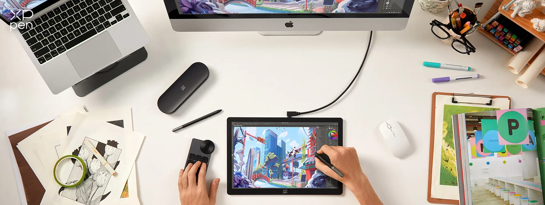
For digital artists, the XPPen Artist Ultra 14 provides an Ultra Clear True Color Portable Drawing Display for this kind of hands-on practice. Its 2.8K OLED display, native 10-bit color, and 99% Adobe RGB, sRGB, help you see subtle differences in color, value, and texture, while the 90Hz refresh rate keeps strokes smooth and responsive.
The Ultra Slim Design , with a body as thin as 6 mm and a weight of 720 g, makes it easy to carry between workspaces. Combined with the X-Touch Solution , which supports multi-point touch and customizable gestures, it gives you a more intuitive way to zoom, rotate, and navigate your canvas while learning, experimenting, and creating.
FAQs about Elements of Design
Q1: Which element of design is the most important?
There is no single most important element. Its importance depends on the project. Color may be central to branding, while value and form may matter more in illustration.
Q2: How do the elements of design work together in a composition?
Design elements rarely work alone. Line, shape, color, space, texture, form, and value interact to create balance, contrast, hierarchy, rhythm, and visual focus.
Q3: How do line, shape, color, texture, space, form, and value affect the mood of a design?
Each element can influence how a design feels. Color affects emotion, line can suggest movement or energy, shape can feel soft or structured, while texture, space, form, and value add depth, atmosphere, and visual weight.
Q4: How can I tell which elements are missing or not working in my design?
Step back and ask: What draws my attention first? Is the composition balanced? Is anything difficult to read or understand? If the design feels flat, chaotic, or disconnected, check whether contrast, hierarchy, space, or other elements need adjustment.
Q5: What exercises can help me practice and understand the elements of design?
Practice one element at a time. Create several compositions using only shapes, then repeat with line, value, color, and texture. Afterward, combine them and compare how each element changes the result.
Q6: What are the best resources for learning the elements of design as a beginner?
Start with design fundamentals books, online tutorials, design software for beginners, and courses, then study existing posters, websites, illustrations, and artworks. Try to identify the elements being used and recreate simple compositions to understand how they work.
Conclusion
The elements of design provide a practical foundation for understanding and creating visual work. Line, shape, color, space, form, texture, and value may seem simple individually, but how they interact can dramatically change a composition.
Instead of simply memorizing the seven elements, focus on recognizing how they affect balance, hierarchy, depth, mood, and visual focus. Regular practice with tools such as the XPPen Artist Ultra 14 can help you experiment with these elements directly and develop a stronger visual sense.
Once you understand why a design feels crowded, flat, unbalanced, or unclear, the elements of design become practical tools rather than just terminology.
About Us
Founded in 2005, XPPen is a leading global brand in digital art innovation under Hanvon UGEE. XPPen focuses on the needs of consumers by integrating digital art products, content, and services, specifically targeting Gen-Z digital artists. XPPen currently operates in 163 countries and regions worldwide, boasting a fan base of over 1.5 million and serving more than ten million digital art creators.
Learn moreRecommended Articles
ROUNDUPS The Best Laptop for Graphic Design in 2026 TIPS 7 Best Clothing Design Software Tools 2026 FOCUSED Best Tablets for Taking Handwritten Notes in 2026 KNOWLEDGE 8 Best Apps for Interior Design (Free & Paid) FOCUSED XPPen Artist Ultra 14 Review: Is It Worth Buying?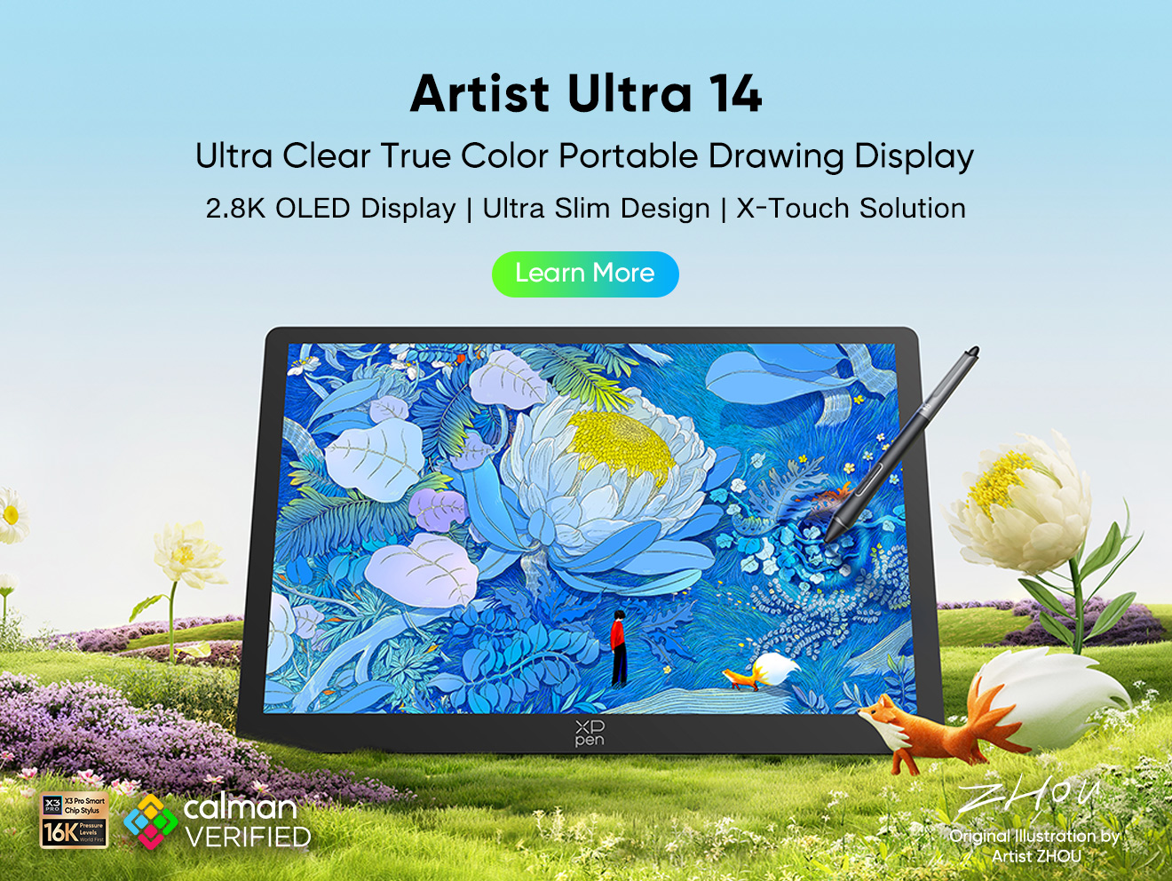



-
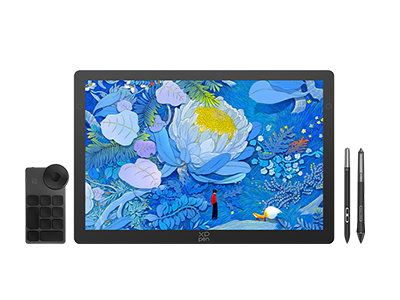 Artist Ultra 14
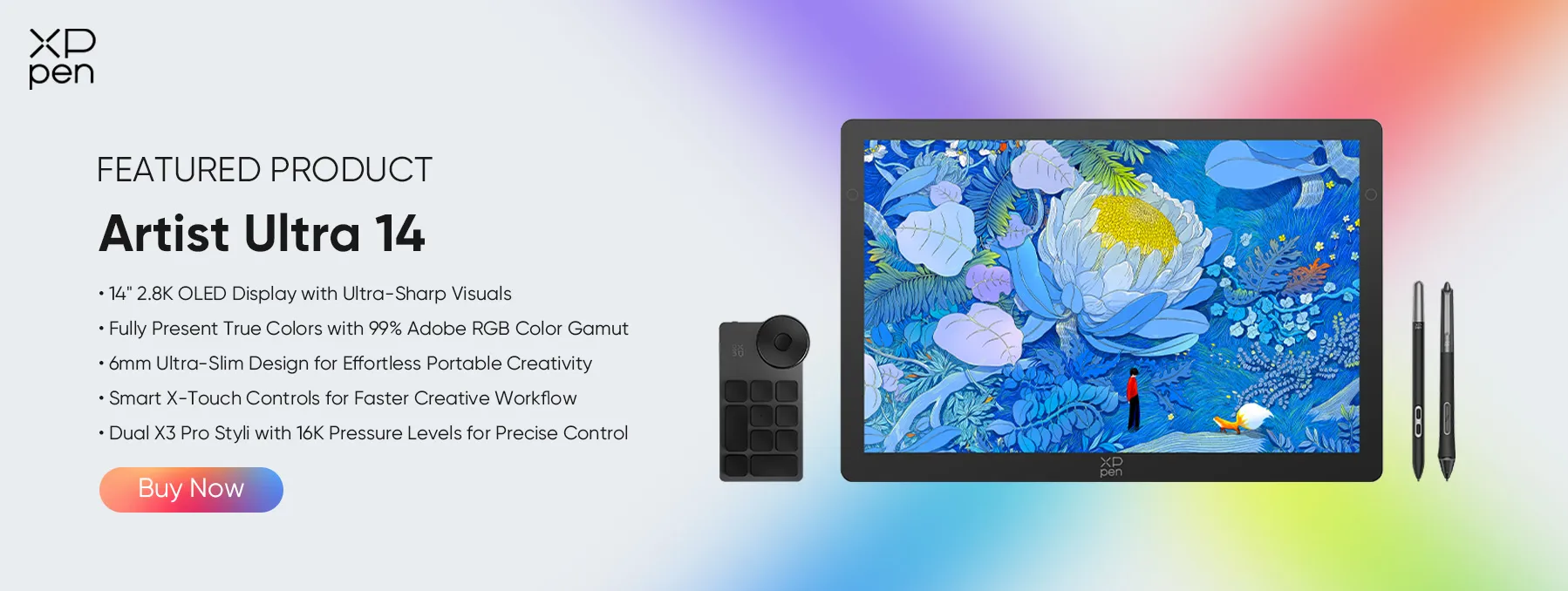
14-inch 2.8K OLED Display with Ultra-Sharp Visuals
99% Adobe RGB Color Gamut for True-to-Life Color
Ultra-Slim 6mm Design for Portable Creativity
Dual X3 Pro Styli with 16K Pressure Levels
Smart X-Touch Controls for Faster Workflow
It features:
Best 14" OLED drawing display for precision and portability
-
Artist Ultra 14
14-inch 2.8K OLED Display with Ultra-Sharp Visuals
99% Adobe RGB Color Gamut for True-to-Life Color
Ultra-Slim 6mm Design for Portable Creativity
Dual X3 Pro Styli with 16K Pressure Levels
Smart X-Touch Controls for Faster Workflow
It features:
Best 14" OLED drawing display for precision and portability
Looking for the Best Drawing & Design Apps?
Discover essential drawing techniques, expert tips, and the best app recommendations to boost your creativity and master digital art.
